Prem Krishnamurthy
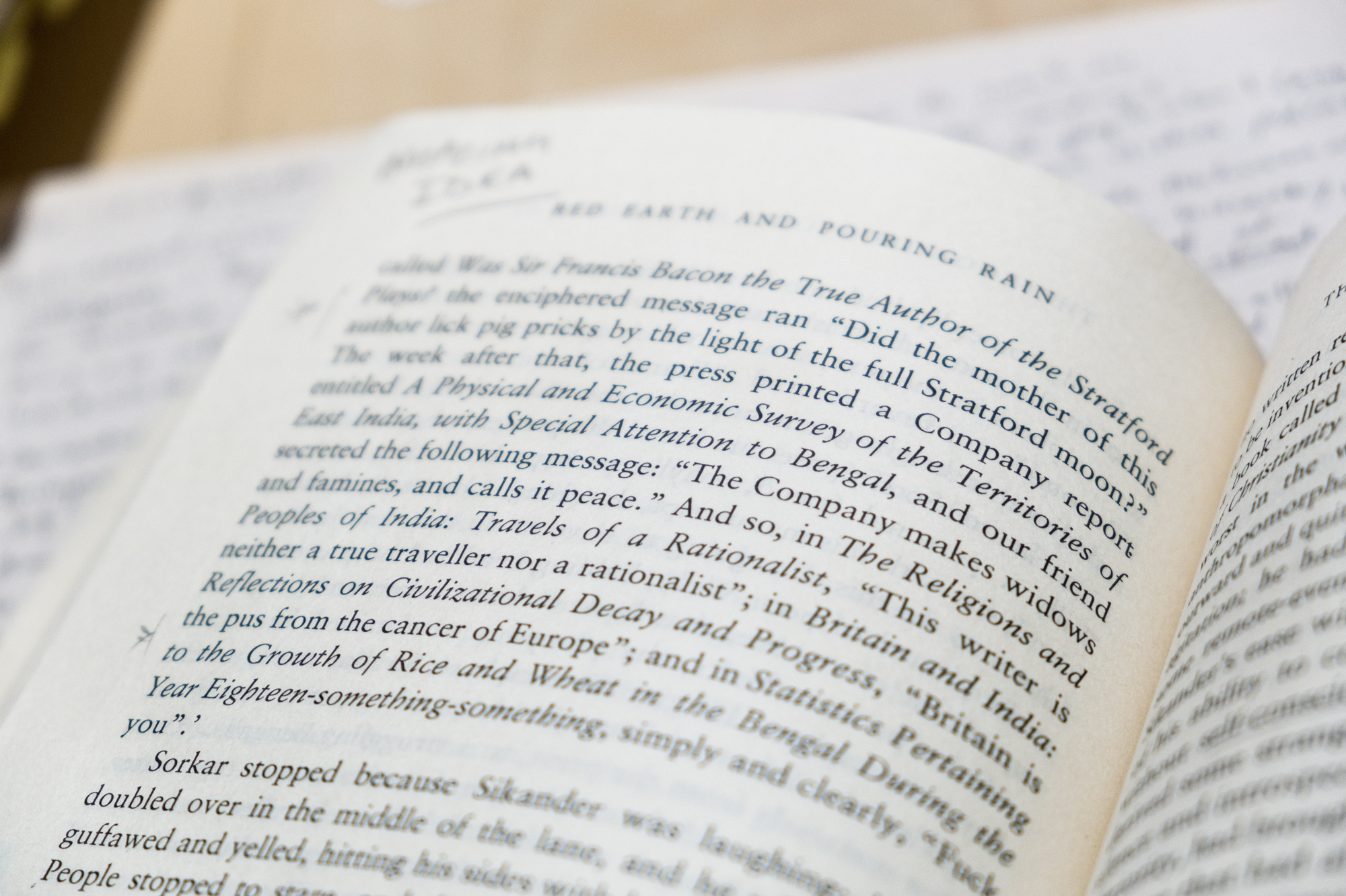
350 pages into Vikram Chandra’s epic novel Red Earth and Pouring Rain, a particular story within a story within a story caught my attention the first time I read it in the mid-aughts. Perhaps one day I’ll pen a lecture on the image of printers within contemporary literature. This one involves the wily Calcutta printer Sorkar, working on commission to an aloof Englishman named Markline. Sorkar wanders his shopfloor, occasionally handing out special letters to his Bengali typesetters to substitute for their fonts. What do these letters spell? It turns out that they are a cipher, a means of encoding secret linguistic jabs against the printer’s British master. They range from political statements such as “The Company makes widows and famines, and calls it peace” to the simple and effective, “Fuck you.”
For me, the kernel was the idea that even within the limited agency that one might possess—as a designer, a printer, a typesetter, a servant rather than a master—there is a small amount of room for resistance, for rebellion, for quiet revolution. A fraction of a hair space, the tiniest of increments, in which one might still be able to act. I employed this idea years later, when conceiving the identity of the cultural institution SALT in Istanbul. But beyond its practical applications in design, Chandra’s parable gave me an opening, personally: the possibility, within the limits of one’s practice and profession, of inserting sand into the proverbial vaseline. It opened up the option of a kind of friction, even at the micro-scale, that might rub things the wrong way, in order to get them a little closer to being right.
In the book, it’s a humorous device, a kind of small-scale sedition that colonial subjects can muster—something like the acts of everyday resistance that Michel de Certeau chronicles in his classic The Practice of Everyday Life. But I don’t have that book with me here, today, and so I’ll have to use just this fictional image of Indian typographic resistance as a way to enter into my main story today. For a bunch of years now, I’ve been “yarning” (to use Australian Aboriginal artist and thinker Tyson Yunkaporta’s fabulous phrase) with folks far and wide about an aesthetic strategy I call “bumpiness”.
I think of it as a productive friction that slows you down, that encourages reflection and reconsideration. It’s something I see at work in art, writing, music, and aesthetic practice more generally. I often position such bumpiness on a spectrum of “smoothness” to “jaggedness”, with smoothness representing the self-evident speed and frictionless-ness of contemporary consumer culture and jaggedness representing the self-consciously anti-attitude of dogmatic resistance. Perhaps bumpiness is somewhere in the middle, something that exists just under the threshold of overtness, like a slightly different letter every page or two that makes you wonder.
For me, this strategy also has a basis in human cognition, the mechanisms that unconsciously underlie our decision-making processes. Nobel-prize winning psychologist Daniel Kahneman differentiates between what he calls fast and slow thinking. The fast thinking, or, in his shorthand, “System 1”, makes quick intuitive judgments based on what it sees. The slower “System 2” represents the analytic functions, which kick in when something needs to be digested more carefully. That being said, System 2 often thinks it is making a smart decision when in fact it has simply made a lazy judgment based on the details at hand. It likes to be efficient and trusts what System 1 tell it, most of the time. Throughout Kahneman’s book, he offers clever, simple ways of challenging System 1 and 2, forcing them to slow down and consider details more carefully.
One particular example stood out to me the first time I read it: a group of Princeton students were given an easy-seeming problem with an obvious, yet also incorrect, answer. Experimenters tested out two modes of typesetting, one with the questions in a “washed-out, gray print.” The scientists found that when the problem was printed in a “bad font”, it improved the students’ test scores, because they had to slow down, allowing them to reject the intuitive and false answer! I recognize this procedure in my everyday life; for example, consider impulse online shopping (particularly during the lockdown of a pandemic). The ease of a one-click Buy Now button means that if we don’t think about it, we can order far more things (in my case: books!) than we actually need. Or consider the typical response to a well-produced online talk: we tend to agree with its conclusions unless we pause for critical consideration. Even slowing down the reflexes by a moment might give our brains the time to reconsider and reevaluate.
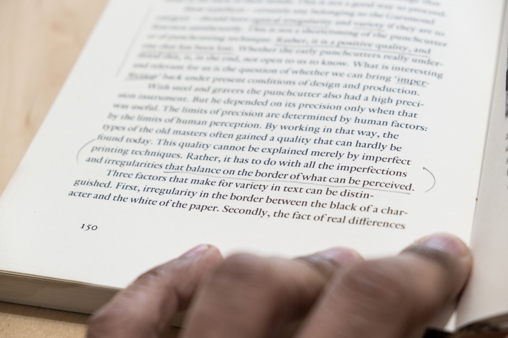
Type designer Fred Smeijers makes a related point from a typographic perspective in his 1996 book Counterpunch. He proposes that perfect, digital typefaces bore the part of the brain that has evolved to stay alert for environmental challenges. From this position, he argues for typefaces that revive the irregularity of analogue, letterpress printed type—the irregularities that, in his opinion, might actually improve legibility and comprehension. It’s sometimes taken for granted that ease, comfort, smoothness are both universal as well as aspirational contemporary experiences.
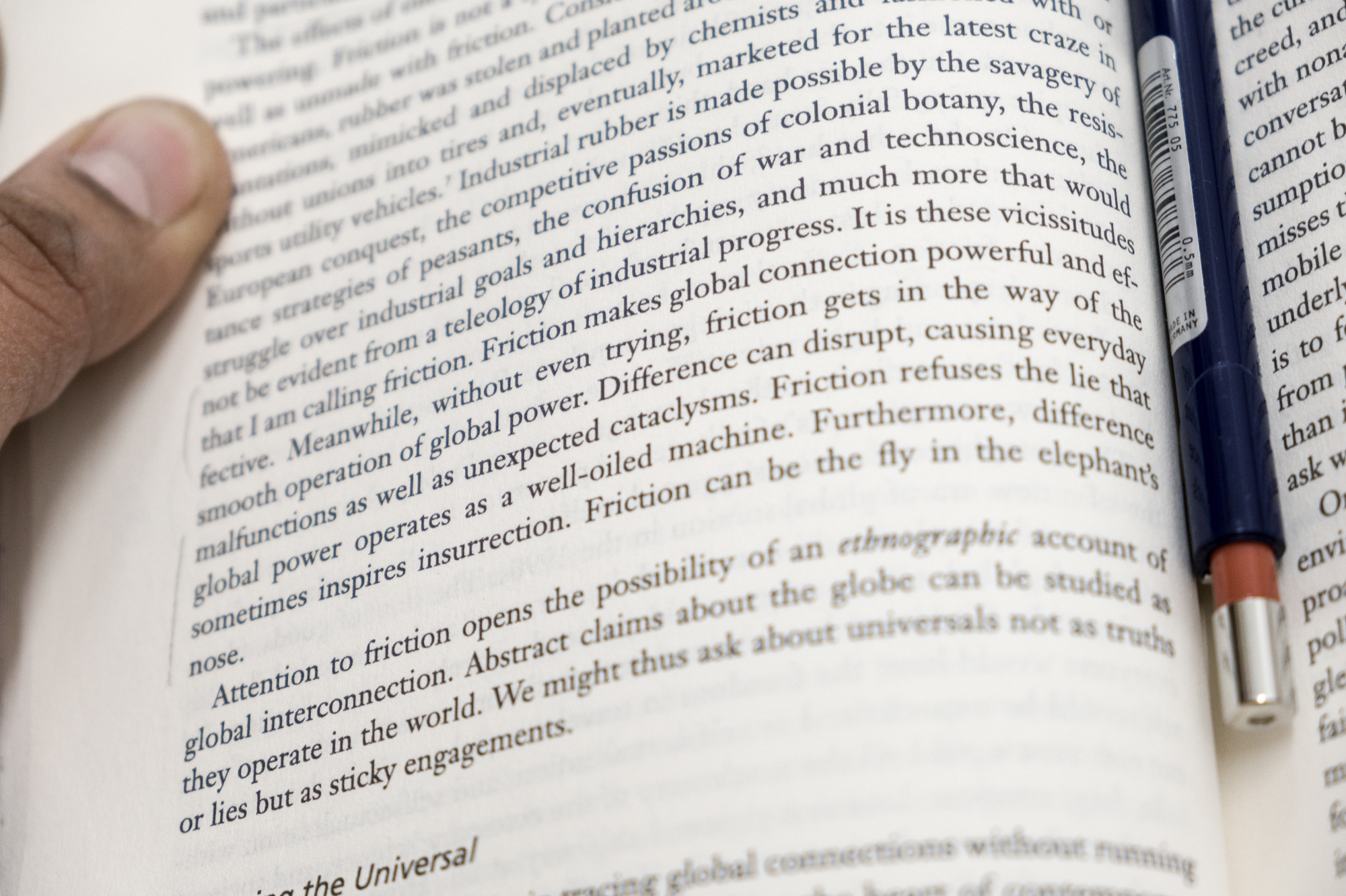
I wonder if this is just the afterglow of the past 30 years of increasing globalization and commodification, in which we’ve come to believe that such smoothness is “natural” and even desirable. As Anna Lowenhaupt Tsing argues convincingly, friction is both what makes capitalism possible as well as the thing that gets in its way. Yet as Sara Ahmed notes in her “A Phenomenology of Whiteness,” this discomfort can also be a position of liberation, a place from which to experience pleasure and excitement, even of the aesthetic kind.


